
UX Research Case Study
Redesigning the navigation to help students and parents

Summary
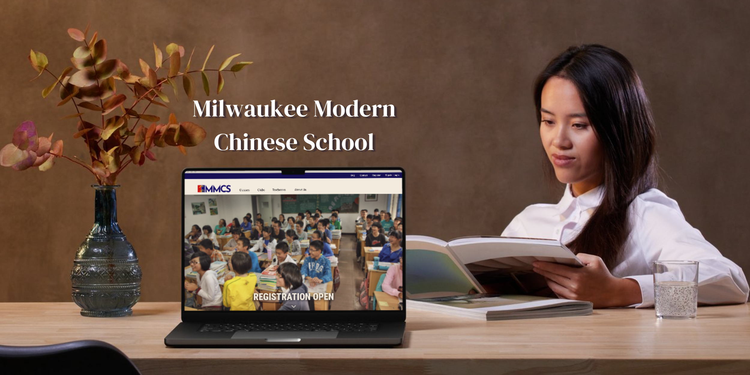
The Milwaukee Modern Chinese School (MMCS) provides classes for students to learn how to read, write, and speak Mandarin Chinese. The MMCS website provides information to students and parents on how to enroll for classes.
Issue: Users are having trouble finding class information.
Role: UX researcher and designer
Timeline: 8 Weeks
Tools: Figma
User Research
Overview
For this survey, I sent the link to a group chat for parents whose children go to the Modern Milwaukee Chinese School, as well as putting the link up around the school. The survey had 10 questions, and I received 14 responses on it.
Questions
Connections to the MMCS to see who the main users are
Extracurricular activities to gauge the user’s interests.
Usage of the site and accessibility
What they thought the website did well and did not do well
“More descriptions on each page would be most welcome”
“May need some multi media to make the site appealing”
“It’s taking a lot of clicks and navigation to find the information I was looking for. ”
“Website is not updated frequently.”


Personas

Usability Testing
Overview
After seeing the issues from the survey, I recruited 4 students and 1 parent from the MMCS campus. The five participants completed 6 tasks and provide a verbal walkthrough of their though processes.
Quick Findings
20% of participants found conflicting info on registration fees
20% of participants were confused because of too much text
60% of participants struggled to read the text
60% of participants did not know what Go club was
80% of participants struggled to find the textbook
Issues
Navigation the website was a big issue for users. The primary function of the website is providing students and parents with the necessary information in order to attend classes at MMCS. However, users struggled to find necessary information such as registration information, required textbooks, and the location of the classrooms.
Unfamiliar Language was an issue for students navigating the website. Since many of the students are attending the school to learn Mandarin, they do not know how to read the language yet. However, some information on the website is in Mandarin such as how to order the required textbooks and what the extracurricular clubs are.


Design
Usability testing showed that users struggled with finding information. I decided that class information and registration would be a big focus of the website and accessible in one location. Since each class has their own required, assigned textbook, general textbook, purchasing information, and links could be included with each classes’ information.
To make the navigation easier, I simplified the number of pages to only the necessary information about classes students can take, the required supplies for classes, general school information such as registration information.

Sketches and Wireframes
I then started on creating low fidelity wireframes and prototypes using Figma. I focused on improving two areas of the website.
Clean and accessible information on classes for Student Jason
Feature to save classes for future registration for Parent Peng
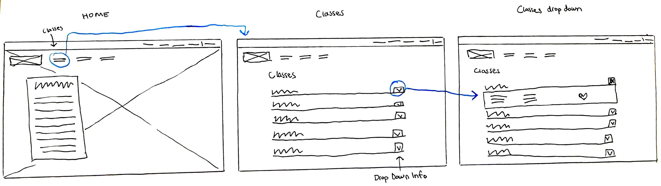
1. Accessible Class Information
On the home page, I added links to the language classes, extracurricular clubs, and textbook purchasing page at the top of the page, next to the logo. This will make it easily spotted since these are the main services of the school.
On the language classes page, a neat way to display the required information for each class while keeping the page clean of too much text clutter was having each class contain a drop down section when clicked. The students would still be able to quickly see what classes the school offered with one right after the other, instead of having to sift through information to see where the titles of classes are. They can also see the information of only the classes they are interested in.
The drop down section also has a link to the textbook that can take students directly to the purchase the book instead of just having the title of the book.
2. Save Class Feature
One feature I am including in this redesign is an option to save classes. Users can highlight specific classes that pique their interest. This allows users a level of customization that the original website did not have.
This feature will alleviate some of the cognitive load of the user by reducing the amount of information they have to memorize. Saved classes will appear on the registration page, so parents would not have to navigate back and forth from the class page to the registration page or remember which classes they want their student enrolled in.

